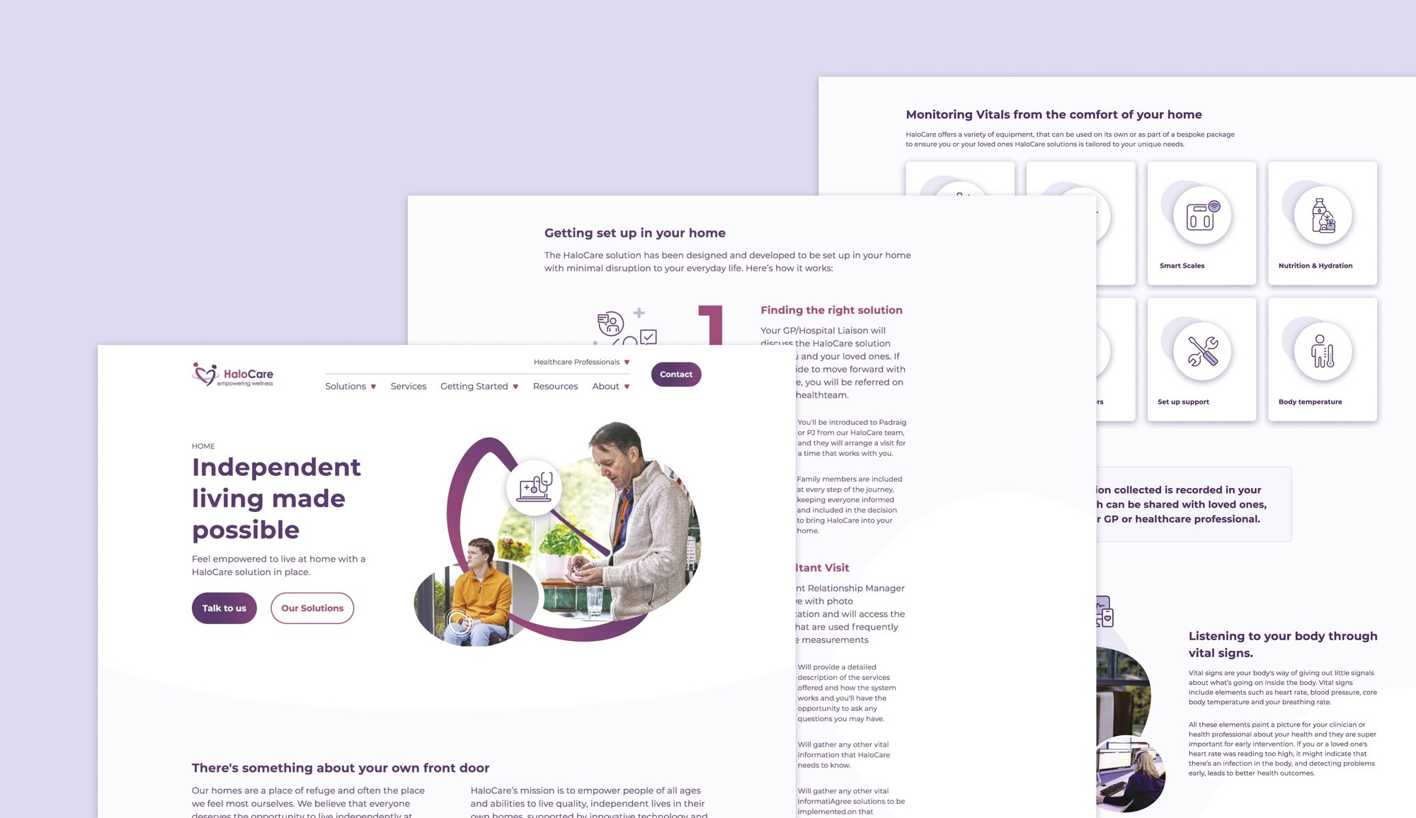
HaloCare, is a health-tech company that specialises in assistive technology for independent living. As part of their ongoing relationship with Wurkhouse, they wanted to make their website more accessible with the aim to meeting the international Web Content Accessibility Guidelines (WCAG) 2.0 AA standards.
In order to do this Wurkhouse conducted a full user experience and user interface review of their website. This was to not only improve the accessibility of the website to the highest standard but also improve the useability of the website.
Once the audit was complete a full report was produced and then presented to HaloCare these recommendations included:
- Improving colour contrasts between text and backgrounds to make pages more readable
- Improving gradients on CTA buttons to make more readable
- Make text left aligned instead of centred for easier readability of pages
- Optimise line spacing for easier readability of pages
- Ensure all videos have subtitles and VO
After the user experience and user interface report was presented an action plan was created and the recommendations of the report were implemented as part of a refresh of the website. The implementation of these changes led to HaloCare’s website meeting the international Web Content Accessibility Guidelines (WCAG) 2.0 AA standards and having a best practice accessible website.
UX and UI was taken into careful consideration at every stage of the HaloCare website journey, to ensure the site met accessibility guidelines within the health sector.
HaloCare were delighted with the website and ultimately decided to have Wurkhouse come onboard to support the in-house marketing team after the creation of the website.


Wurkhouse were involved in this project from the very early days. We worked closely with the Interior Designer and the Travelodge marketing team, which was crucial to understanding the vision and plans for the restaurant - yet to be build - and the envisioned future guests.
We developed a look & feel for the brand which took inspiration from distinctive features of the restaurants interior design, as seen on fabrics, carpets, lights, seating areas or tiles and combined it with illustrations of moss plants reflective of the restaurant’s name, the street it sits on and the chef’s devotion to fresh food. After offering a variety of initial concepts, a clear route was chosen together with the Travelodge marketing team and the brand rolled out across print materials, digital designs and signage.
All onsite and offsite SEO activities
Website support that is aligned with the marketing
Conversion Rate Optimisation
Google Advertising strategy, copy, implementation, management and optimisation
LinkedIn advertising strategy, creation (copy and graphics), management and optimisation

What our clients said

We highly recommend Wurkhouse for branding, logo and creative development. Their team, led by Eva played a pivotal role in launching our Mossco kitchen, bar, and cafe at Travelodge Plus Dublin City Centre. From initial concepts to logo design to branding guidelines to final assets, their attention to detail and creative suggestions were exceptional. Client services provided by Hannah is excellent. We're delighted with the results and continue to work with them ongoing for mossco.ie and our restaurant.
David (Marketing Manager – Travelodge Plus Dublin City Centre)


